
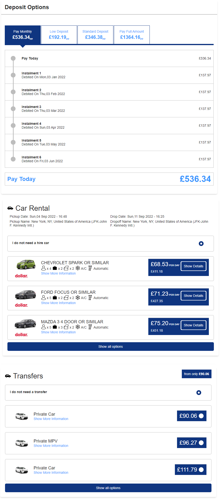
The Availability Extras widget is the third stage of the booking flow:
Search > Results > Extras > Basket
This widget serves several functions:
(a) To collect the guest/passenger details, which will be sent to the supplier once a successful payment has been made.
(b) To give customers the option to pay a deposit / instalments, if you have them configured within Deposit Rules
(c) Give you an easy way to cross sell additional travel products to the customer, to maximise basket value and increase profit per booking (Requires appropriate suppliers to be connected)
NOTE: Although this widget has self contained configuration options, you still need to configure other widgets to ensure the upsell and deposit functionality works throughout the booking flow. Learn more here.
1.
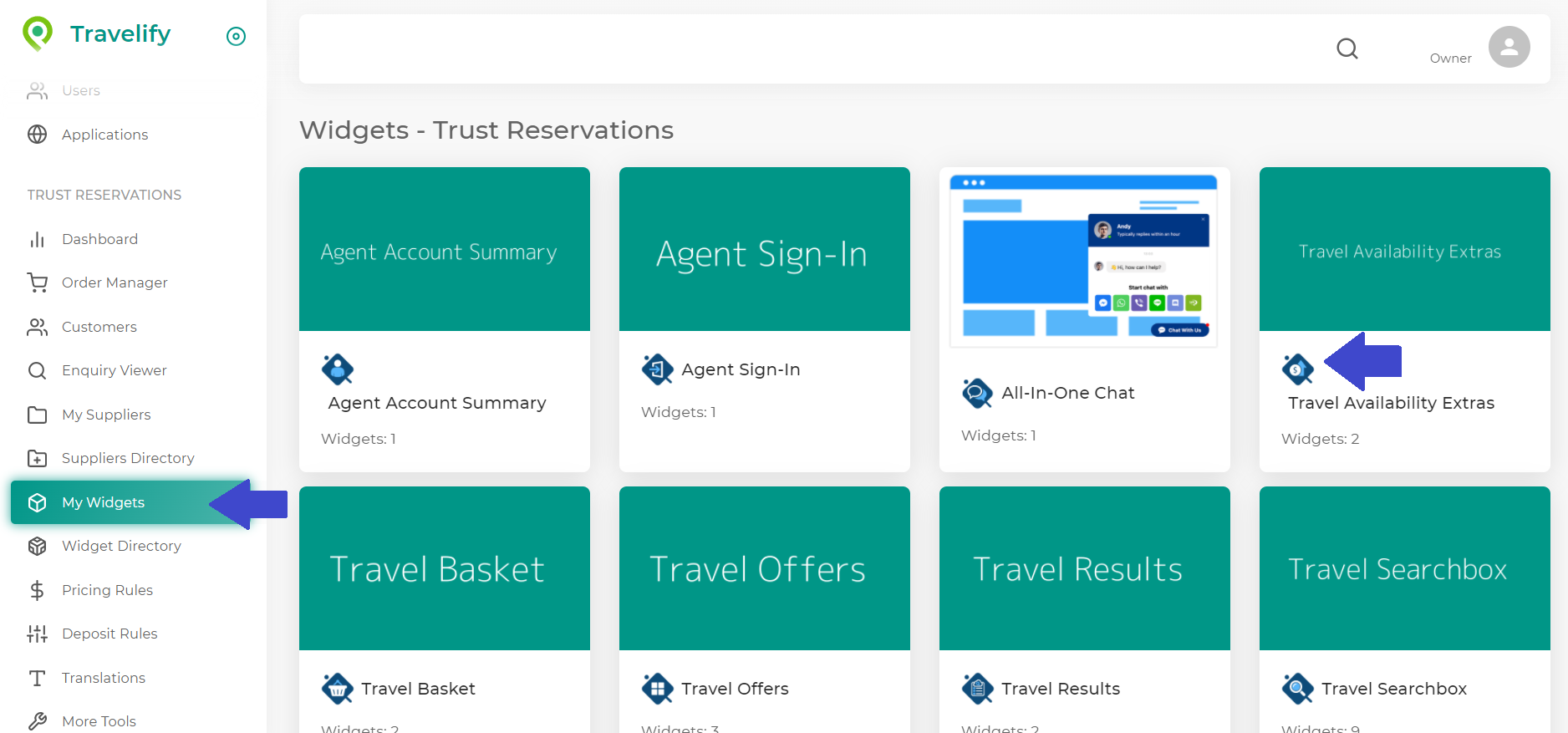
Log into Travelify > My Widgets > Travel Availability Extras
2.
On the dashboard, click the Add new widget button, and you will be presented with all the configuration options available to you. From the navigation link on the left side of the page, you will see the heading Layout. This lets you configure the layout of all the elements in this widget.
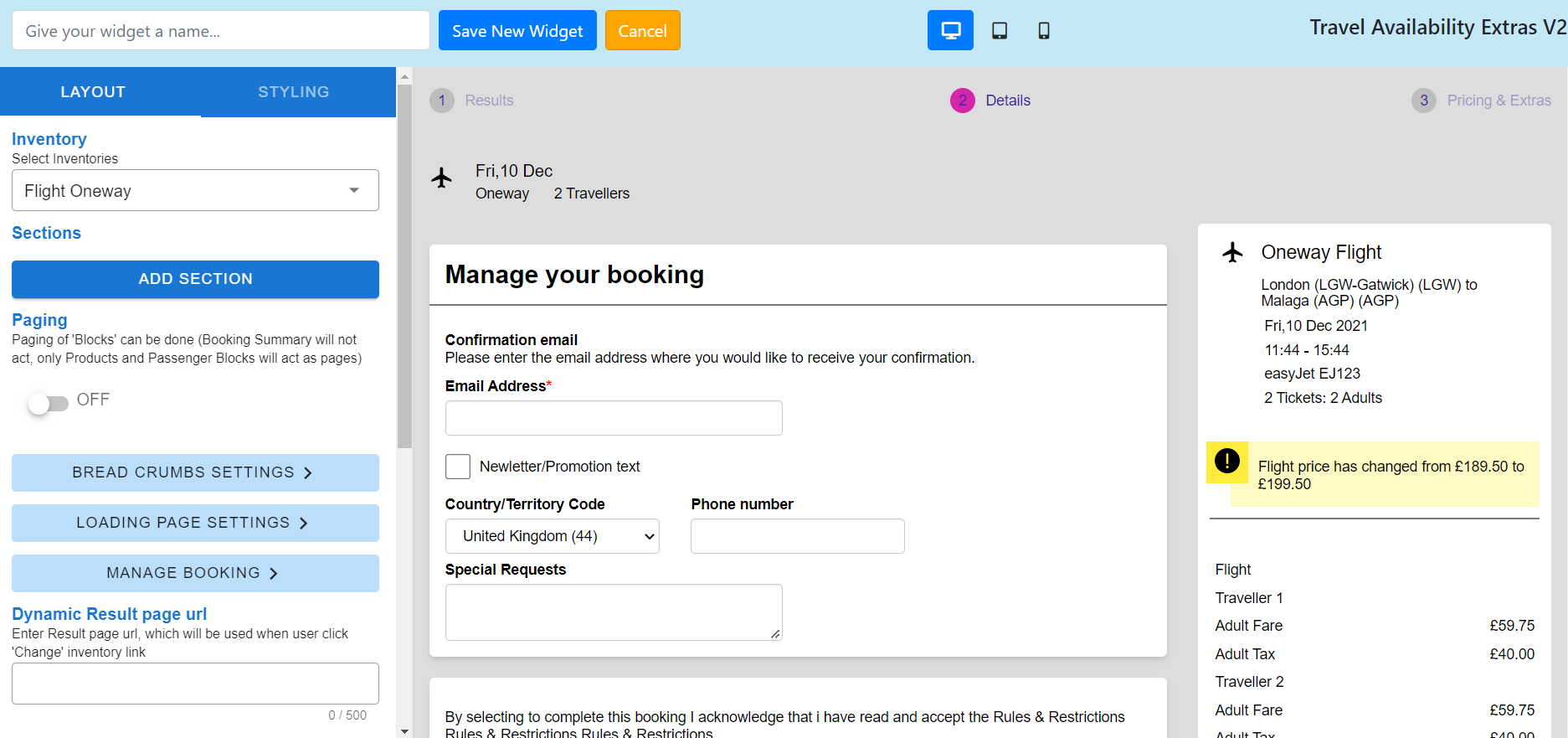
- Inventory (This allows you to switch views, based on the the of product being purchased by the customer)
- Sections
- IMPORTANT: Add all the sections that you want to appear on this page. If you don't add all the sections you need, the booking and/or upsell process may not work as expected.
- Add Section
- Products
- Flight order (Select a number, to dictate the position of this product on the page)
- Hotel order (Select a number, to dictate the position of this product on the page)
- Car order (Select a number, to dictate the position of this product on the page)
- Transfer order (Select a number, to dictate the position of this product on the page)
- Airport and extras order (Select a number, to dictate the position of this product on the page)
- Tickets and attractions order (Select a number, to dictate the position of this product on the page)
- Title (Flight inventory) - Display title for the Flight inventory
- Title (Accommodation inventory) - Display title for the accommodation inventory
- Title (Car inventory) - Display title for the car inventory
- Title (Transfer inventory) - Display title for the transfer inventory
- Title (Lounge inventory) - Display title for the lounge inventory
- Title (Parking inventory) - Display title for the parking inventory
- Title (Hotel inventory) - Display title for the hotel inventory
- Title (Tickets & attraction inventory) - Display title for tickets & attraction inventory
- Passenger Details
- Title (Passenger section
- Subtitle (Passenger section)
- Enable/Disable folding (Passenger section) - On/Off
- Booking summary
- Title
- Subtitle
- Enable/disable folding - On/Off
- Enable/disable purchase button
- Purchase button text
- Title (Static content)
- Subtitle (Static content)
- Bullet blocks
- Add section
- Content text
- Add section
- Deposit option
- Title
- Subtitle
- Pay full amount (Tab)
- Pay full amount (Message)
- Selected tab colour (Background)
- Tab (Background colour)
- Tab (Background colour - mobile view)
- Active tab (Font colour)
- Price text colour
- Breakdown line/border colour
- Information (Message)
- Pay today (Label)
- Instalment (Label)
- Debited on (Label)
- Upsell car
- Title (Block)
- Upsell transfer
- Title (Block)
- Upsell Airport extras
- Title (Block)
- NOTE: Once added, you can drag each section to reorder how they appear on the page.
- Products
- Paging
- Display sections in a "paging" style (E.g. Complete one section before seeing the next one)
- Breadcrumb settings
- Breadcrumbs type
- Default
- Results label text
- Detail label text
- Pricing and extra label text
- Stages number background
- Stages number disable background colour
- Stages font colour
- Classic
- Shape
- Circle
- Square
- Rectangle
- Label stage 1
- Label stage 2
- Label stage 3
- Content title
- Content text
- Content title colour
- Stages number background colour
- Stages number disable background colour
- Stages font colour
- Shape
- Classic One
- Label stage 1
- Label stage 1 (mobile)
- Label stage 2
- Label stage 2 (mobile)
- Label stage 3
- Label stage 3 (mobile)
- Stages number background colour
- Stages number disable background colour
- Stages font colour
- Stages arrow colour
- None
- Default
- Breadcrumbs type
- Loading page settings
- Add Block
- Loader Style (The animation that appears on the results loading page)
- Loading options
- Spinning circle
- Loader bar
- Upload image (You can upload an animated file like .GIF to display a custom animation)
- Loading options
- Title text
- Title (The title copy that your visitors see on the loading page)
- Font size
- Font colour
- Font style
- Description text
- Enter descriptions (The description text that your visitors see on the loading page)
- Font size
- Font colour
- Font style
- Show Search Criteria (The visitors search criteria they see on the loading page)
- Font size
- Font colour
- Font style
- Images
- Upload an image to display on the loading page
- Spacer
- Spacer height ( To introduce a spacer to the loading page)
- Loader Style (The animation that appears on the results loading page)
- Loading Page Background Colour
- Loading Page Background Border Colour
- Loading Page Background Border (Thickness of the border)
- Loading Page Background Border Radius (Rounder corners on the border)
- Pickup location name
- Dropoff location name
- Start time
- End time
- Origin name
- Destination name
- Outbound flight time
- Return flight depart time
- Return flight arrival time
- Add Block
- Manage booking
- Title
- Subtitle
- Body text
- Purchase section body text
- Purchase button text
- Email address
- Country/Territory code
- Phone number
- Enable/disable (Newsletter or promotion confirmation) = On/Off
- Newsletter / Promotion text
- Dynamic result page URL (Enter Result page url, which will be used when user click 'Change' inventory link)
- Dynamic basket page URL (Enter Basket page url)
- Dynamic homepage URL (Enter Home page url, if system fails to get session data from url params, it will forward)
- Your trip label
- Open link in new window - On/Off
3.
Once you have configured the layout, click Styling in the header on the left side of the page. This lets you configure all the style settings for this widget.
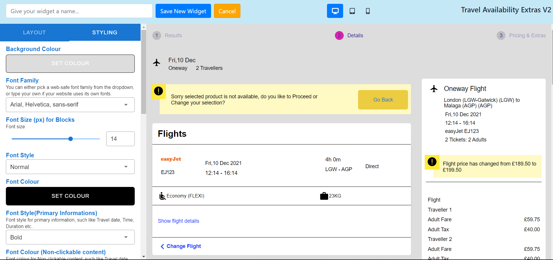
- Background colour
- Font family
- Font size (px) for blocks
- Font style
- Font colour
- Font style (Primary informations) - Font style for primary information, such like Travel date, Time, Duration etc.
- Font colour (Clickable content) - Font colour for Clickable content, such like Detail link, Change link etc.
- Astrix font colour
- Flight section styles
- Flight Section Icon
- Detail link Text
- Detail link Text(Opposite)
- Flight Detail Layout
- Change flight link Text
- ArrivalOn Text Colour
- ArrivalOn Text Style
- Change Flight Icon
- Airline Logo width
- Hotel section styles
- Hotel Section Icon
- Hotel Name Style
- Detail link Text
- Detail link Text(Opposite)
- Change hotel link Text
- Hotel Section Icon
- Amenity Icon
- Car styles
- Car Section Icon
- Detail link Text
- Detail link Text(Opposite)
- Change car link Text
- Car Change Icon
- Car Name Style
- Pickup (Label)
- Pickup Time (Label)
- Pickup Address (Label)
- Dropoff (Label)
- Dropoff Time (Label)
- Dropoff Address label Text
- Features label Text
- Inclusions label Text
- Pickup label(Fare Summary)
- Dropoff label(Fare Summary)
- Style (Important text)
- Pickup Date (Label - Upsell)
- Drop Date (Label - Upsell)
- Show all options (Label - Upsell)
- Default text for 'No Car' preference (Upsell)
- Show Details(Label - Upsell)
- Transfer styles
- Section Icon
- Detail link Text
- Detail link Text(Opposite)
- Change car link Text
- Change Icon
- Sub Heading Font Size (px)
- Operator Name Style
- Operator Title Style
- Operator label Text
- Journey duration label Text
- Passenger capacity label Text
- Luggage Allowance label Text
- Out Pickup label Text
- Out Dropoff label Text
- Return Pickup label Text
- Return Dropoff label Text
- Pick/Dropoff Title Text
- Pick/Dropoff Name label Text
- Pick/Dropoff Date and Time label Text
- Out Pickup/Dropoff label(Fare Summary)
- Return Pickup/Dropoff label(Fare Summary)
- Pickup/Dropoff Text Style
- Pickup/Dropoff Subtitle Text Style
- Cheapest fare label(Upsell)
- Default text for 'No Transfer' preference (Upsell)
- Show all options (Label - Upsell)
- Airport extras styles
- Section Icon (Parking)
- Hotel/Lounge Section Icon
- Detail link Text
- Detail link Text(Opposite)
- Change link Text
- Change Icon
- Product Title Style
- Description Text Style
- Description label Text
- Info label Text
- Photo label Text
- Map label Text
- Included Features label Text
- Included Features Label Text Style
- On Airport Label
- Terminal Label
- Star colour (Hotel Star rating)
- Free Cancellation label Text
- Free Cancellation Background colour
- Free Cancellation text colour
- Title Style(Free Cancellation)
- Border Radius (px) - Free Cancellation
- Padding (px) - Free Cancellation
- Read more label Text
- Less/Hide label Text
- Cheapest fare label(Upsell)
- Default text for 'No Lounge' preference (Upsell)
- Default text for 'No Parking' preference (Upsell)
- Default text for 'No Hotel' preference (Upsell)
- Default text for 'No Hotel With Parking' preference (Upsell)
- Default text for 'No FastTrack' preference (Upsell)
- Show all options (Label - Upsell)
- Show Details(Label - Upsell)
- Booking summary styles
- Style
- Discount label
- Discount text colour
- Discount text style
- Static text style (Bullet text)
- Static text colour (Bullet text)
- Passenger block styles
- Passenger title (label)
- Passenger first name (Label)
- Passenger last name (Label)
- Passenger date of birth (Label)
- Extras styles
- Title(Extras section)
- Subtitle(Extras section)
- Enable/Disable folding(Extras section)
- Baggage Icon
- Meal Icon
- Extras - Luggage (Label)
- Extras - Meal (Label)
- Extras - Other Service (Label)
- Extras - Cheapest Text (Label)
- Extras - Show more (Label)
- Extras - Hide (Label)
- Question styles
- Title (Question section)
- Subtitle (Question section)
- Enable/disable folding (Question section) - On/Off
- Button styles
- Background colour
- Font colour
- Border radius (px)
- Top and bottom padding (px)
- Left & right padding (px)
- Enable/disable shadow - On/Off
- Button label (Upsell product)
- Block styles
- Background Colour
- Title Background Colour
- Font Colour
- Title Font size (px)
- Title Style
- Detail Link Text Style
- Change link Text Style
- Border Radius (px)
- Upward/Downward Arrow Colour
- Info icon Font color
- Background colour (Tab)
- Text colour (Tab - Active)
- Tab Font Style
- Border (px) (Tab)
- Border Radius (px) (Tab)
- Top/Bottom Padding (px) (Tab)
- Right/Left Padding (px) (Tab)
- Important label Text
- Font Style(Popup Title)
- Font Style(Popup Content)
- Font Colour(Popup Title)
- Font Colour(Popup Content)
- Font Size (px) (Popup Title)
- Background Colour (Radio button) - Upsell
- Border Colour (Radio button) - Upsell
- Background Colour (Radio button - Checked) - Upsell
- Border Colour (Radio button - Checked) - Upsell
- Background Colour (Upsell - 'More Options')
- Font Colour (Upsell - 'More Options')
- Textbox styles
- Background colour for blocks
- Border radius
- Background colour for blocks
- Border bottom only
- Border format
- Notification styles
- Background Colour
- Font Colour
- Font Style
- Border Colour
- Border thickness (px)
- Border Radius (px)
- Border format
- Title
- Message Text
- Advanced Price change messages
- Price change message Text
- Title
- Enable Ignore text
- Background Colour (GoBack)
- Font Colour (GoBack)
- Buttons Active Font Colour (GoBack/Ignore)
- Border Radius (px) (Buttons)
- Button Font Style
- Top and Bottom padding (px)
- Left & Right Padding (px)
- Enable Icon
- Icon
- Icon Background Colour
- Icon Colour
- Enable Shadow
- Line colour
Comments
0 comments
Article is closed for comments.