
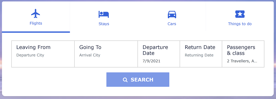
Our Travel Searchbox widget lets your end-users search for travel products on your website.
It allows end users to input search criteria, that connects to the products provided by your third party suppliers.
The results will be displayed on a separate page, using the Travel Results widget.
Create your Travel Searchbox Widget
1.
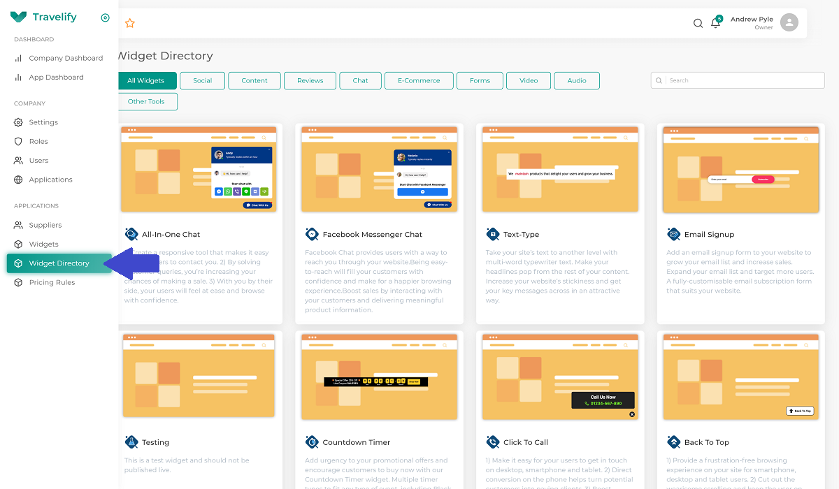
Log into your Travelify dashboard and click on Widget Directory from the side menu. Locate and click on the Travel Searchbox widget, then click the Add New Widget button.
2.
You will be presented with the widget editor that lets you customise the look of the widget and the way it works. Some settings will present additional configuration options as you go through the set up process. These are the configuration options available to you under Search in the header of the side menu.
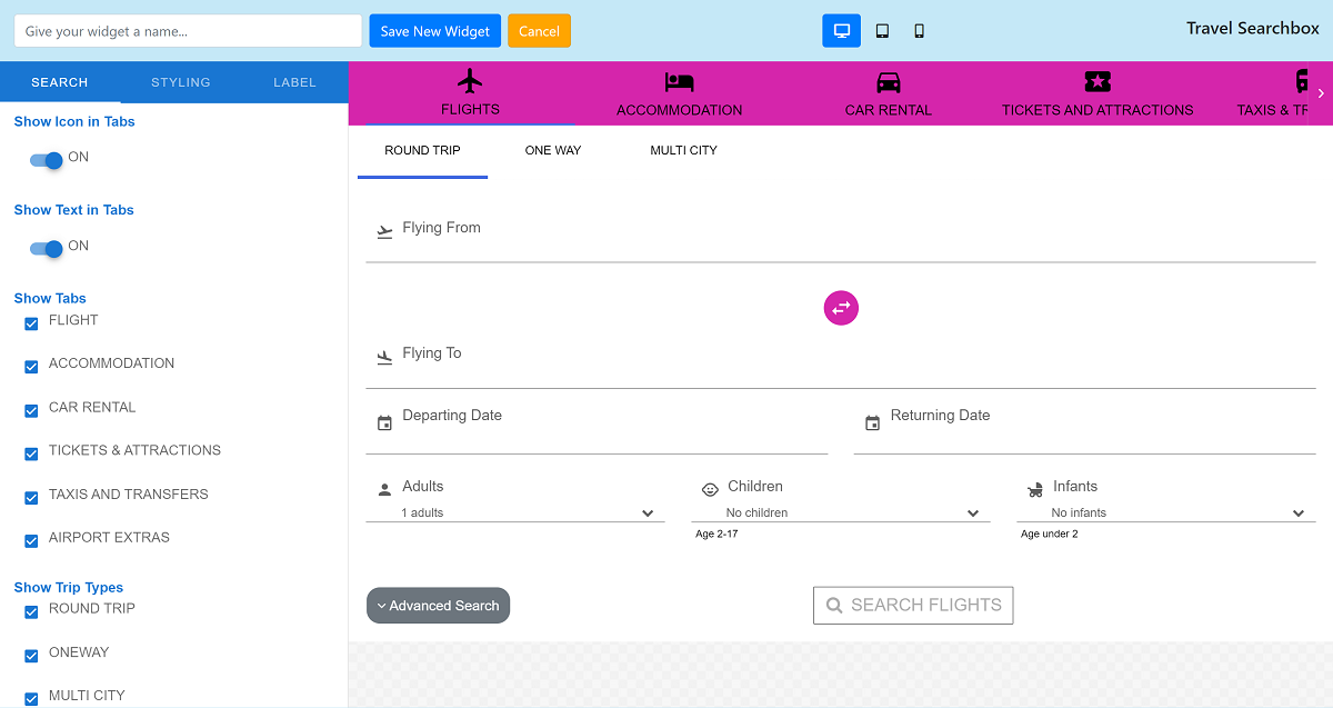
- Show Icon In Tabs - On/Off
- Show Text In Tabs - On/Off
- Show Tabs - Show/Hide (Note: The wording of these tabs can be changed in "Label")
- Flight
- Accommodation
- Car Rental
- Tickets & Attractions
- Taxis & Transfers
- Airport Extras
- Show Trip Types - Show/Hide
- Round Trip
- One Way
- Multi City
- Language Settings
- Language - Dropdown menu (Allows you to select the language set up for this widget)
- Default Values Settings
- Modal Default Values
- Cabin Class Default Value
- Any Cabin Class
- Economy
- Premium Economy
- Business
- First Class
- Nationality Default Value
- [Various Options]
- Reason For Travel Default Value
- Unspecified
- Personal
- Business
- Currency Default Value
- [Various Options]
- Cabin Class Default Value
- Flight Tab Default Values
- Default Depart Date From Today
- Default Return Date
- Adults Default Value
- Children Default Value
- Infants Default Value
- Accommodation Tab Default Values
- Rating Default Value
- [Various Options Based On Star Rating]
- Max Distance Default Value
- [Various Options Based on Number Of Miles From Search Location]
- Check In Default Date From Today
- Input the number of days (E.g. 10 = check in defaults to 10 days from today)
- Check Out Default Date
- Input the number of days (E.g. 3 = check out 3 days after check in)
- Adults Default Value
- [Various Options]
- Children Default Value
- [Various Options]
- Infants Default Value
- [Various Options]
- Rating Default Value
- Car Rental Tab Default Values
- Driver Age
- 18-24 Years Old
- 25-29 Years Old
- 30-70 Years Old
- 71- Years Old
- Default Pick Up Date From Today
- Input the number of days (E.g. 10 = Pick up 10 days from today)
- Default Drop Off Date
- Input the number of days (E.g. 3 = Drop off 3 days after pick up)
- Show Drop Off Location
- On/Off
- Driver Age
- Tickets and Attractions Tab Default Values
- Start Date
- Input the number of days (E.g. 10 = 10 days from today)
- To Date Duration
- Input the number of days (E.g. 3 = 3 days after start date)
- Maximum Distance From Location
- [Various Options Based on Number Of Miles From Search Location]
- Adults Default Value
- [Various Options]
- Children Default Value
- [Various Options]
- Infants Default Value
- [Various Options]
- Start Date
- Taxis and Transfers Tab Default Values
- Start Date
- Input the number of days (E.g. 10 = 10 days from today)
- Return Date
- Input the number of days (E.g. 3 = 3 days after start date)
- Adults Default Value
- [Various Options]
- Children Default Value
- [Various Options]
- Infants Default Value
- [Various Options]
- Start Date
- Airport and Extras Tab Default Values
- Departure Date
- Input the number of days (E.g. 10 = 10 days from today)
- Return Date Duration
- Input the number of days (E.g. 3 = 3 days after departure date)
- Adults Default Value
- [Various Options]
- Children Default Value
- [Various Options]
- Infants Default Value
- [Various Options]
- Departure Date
- Modal Default Values
- Layout Style
- Classic
- Modern
- Modern Slim
- Default Search Option - Controls which search tab is the primary tab by default (E.g. Displays on page load)
- Flight
- Accommodation
- Car Rental
- Tickets & Attractions
- Transfers
- Airport Extras
- Date Settings
- Minimum Date - Input a number, that represents the lead time on booking a travel product
- E.g. 0 = End users can book and check into a hotel tonight.
- 1 = End users can't check into a hotel until tomorrow night
- 7 = End users can't check into a hotel room for another 7 days
- Maximum Date - Input a number, that represents how far in advance an end-user can book a travel product
- E.g. 10 = End users can only check into a hotel in the next 10 days
- 30 = End users can only check into a hotel in the next 30 days
- 365 = End users can check into a hotel room in the next 365 days
- Duration - Input a number, that represents the maximum duration of a travel product
- E.g. 3 = End users can only stay at a hotel for a maximum of 3 nights
- 7 = End users can only stay in a hotel for a maximum of 7 nights
- 14 = End users can only stay in a hotel for a maximum of 14 nights
- Minimum Date - Input a number, that represents the lead time on booking a travel product
- Tab Position
- Left
- Right
- Centre
- Search Button Position
- Left
- Right
- Centre
- Maximum Number Of Rooms - The maximum number of rooms an end-user is able to search for. Check with your suppliers as to what they support.
- 3
- 6
- First Day Of The Week - Configure what the first day of the week is in the date pickers within the search box
- Domain URL - Input the URL of your website, that the Results Widget will be embedded. This allows the search box to pass the end-user search criteria through to the results page and show them the travel products they're interested in.
- Show Nationality
- [Various Options]
- Show Currency
- [Various Options]
- Passenger Select Style
- Classic
- Modal
3.
Once you have set up everything in Search, click on Styling in the header of the side menu. This lets you configure the style and branding of this specific widget, like fonts, font colours, background colours, button colours, icons etc
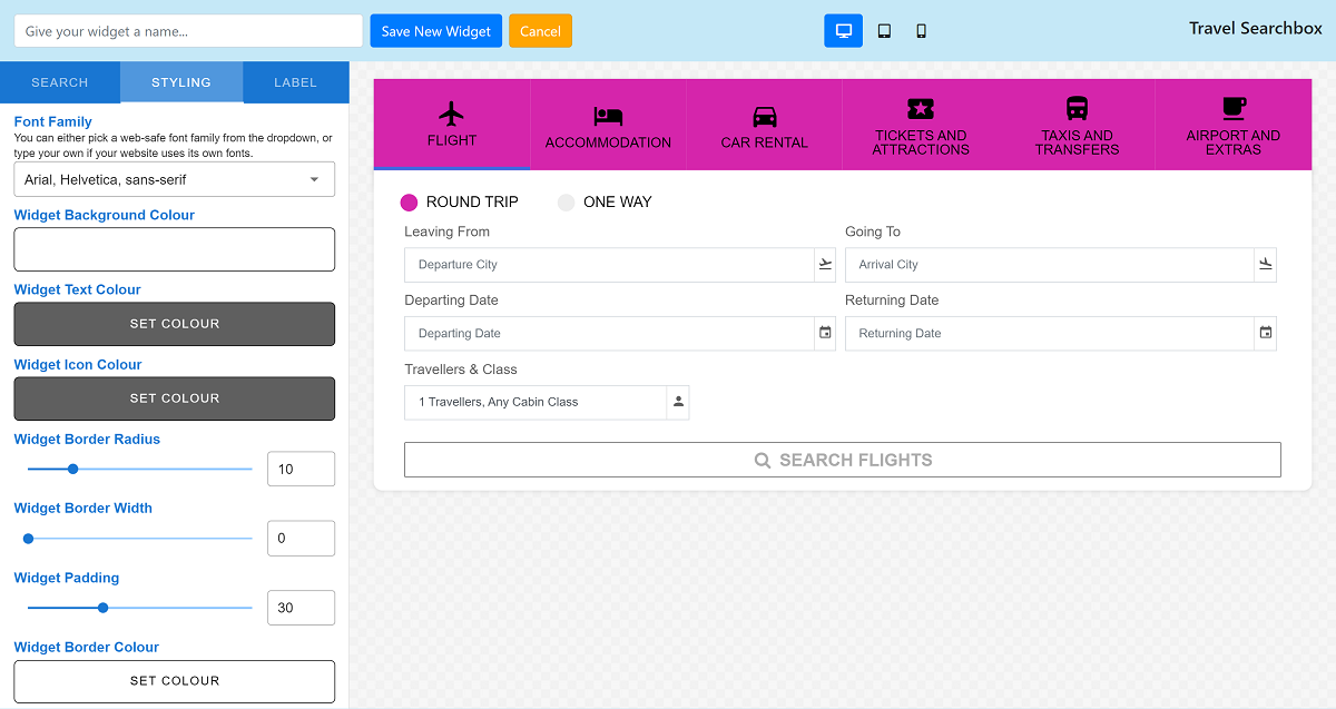
- Font Family - Choose the font to display within the widget
- Widget Background Colour
- Widget Text Colour
- Widget Icon Colour
- Widget Border Radius
- Widget Border Width
- Widget Padding
- Widget Border Colour
- Dropdown List Hover Background Colour
- Description Text Font Colour
- Description Text Font Size
- Widget Font Size
- Label Font Size
- Primary Tab Styles
- Background Colour
- Text Colour
- Hover Background Colour
- Icon Colour
- Active Tab Colour
- Background Style
- Coloured
- Transparent
- Transparent Intensity
- Active Tab Style
- Border
- Background Colour
- Tab Style
- Solid
- Spaced
- Maximum Width
- Font Size
- Height
- Primary Button Styles
- Background Colour
- Text Colour
- Hover Background Colour
- Hover Text Colour
- Font Size
- Border Radius
- Border Width
- Border Colour
- Disabled Button Styles - Displays until sufficient search criteria has been inputted, then switches to "Primary Button Style"
- Background Colour
- Text Colour
- Hover Background Colour
- Hover Text Colour
- Font Size
- Border Radius
- Border Width
- Border Colour
- Flights Tab Styles
- Secondary Tab Styles
- Background Colour
- Text Colour
- Hover Background Colour
- Secondary Tab Styles
- Accommodation Tab Styles
- Secondary Tab Styles
- Background Colour
- Text Colour
- Font Size
- Border Radius
- Border Width
- Border Colour
- Hover Background Colour
- Hover Text Colour
- Room Label Styles
- Font Size
- Text Colour
- Secondary Tab Styles
- Advance Search Button Styles
- Background Colour
- Text Colour
- Background Hover Colour
- Hover Text Colour
- Font Size
- Border Radius
- Border Width
- Border Colour
- Modal Styles
- Text Colour
- Heading Colour
- Icon Colour
- Border Radius
- Border Colour
- Border Width
- Background Colour
- Passenger Modal Styles
- Background Colour
- Text Colour
- Border Radius
- Border Colour
- Border Width
- Error Background Colour
- Label Font Size
- Primary Button Styles
- Background Colour
- Text Colour
- Hover Background Colour
- Hover Text Colour
- Font Size
- Border Radius
- Border Width
- Border Colour
- Disabled Button Styles
- Background Colour
- Text Colour
- Hover Background Colour
- Hover Text Colour
- Font Size
- Border Radius
- Border Width
- Border Colour
- Modal Cancel Button Styles
- Background Colour
- Text Colour
- Hover Background Colour
- Hover Text Colour
- Font Size
- Border Radius
- Border Width
- Border Colour
- Modal OK/Done Button Styles
- Background Colour
- Text Colour
- Hover Background Colour
- Hover Text Colour
- Font Size
- Border Radius
- Border Width
- Border Colour
4.
After you have updated the Styling, click Label in the header menu on the left of the page. This lets you configure the wording that displays to your end-users within this search box (E.g. "Hotels" rather than "Accommodation")
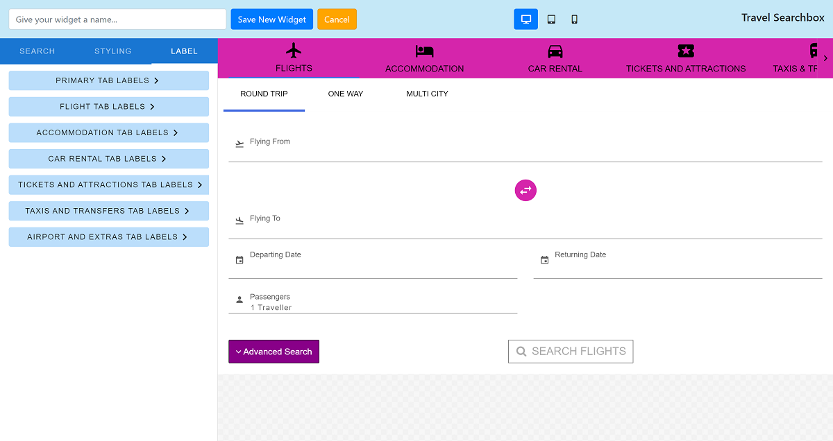
- Primary Tab Labels
- Flight Label
- Accommodation Label
- Car Rental Label
- Tickets and Attractions
- Taxis and Transfer
- Airport Extras
- Flight Tab Labels
- Secondary Tab Labels
- Round Trip Label
- OneWay Trip Label
- MultiCity Trip Label
- Flying Fields Label
- Flying From Label
- Flying To Label
- Date Fields Label
- Departing Date Label
- Returning Date Label
- Passenger Field Label
- Adults Field Label
- Children Field Label
- Infant Field Label
- Passengers Field Label
- Button Text
- Search Flight
- Advanced Search
- Add Another Flight
- Modal Fields Label
- Cabin Class
- Nationality
- Reason For Travel
- Currency
- Travellers and Class
- Secondary Tab Labels
- Accommodation Tab Labels
- Location Field Labels
- Location Label
- Maximum Distance Location Label
- Rating Label
- Date Field Label
- Check In Label
- Check Out Label
- Button Labels
- Search Button Label
- Advanced Button Label
- Secondary Button Label
- Remove Room Button Label
- Modal Fields Label
- Nationality
- Reason For Travel
- Currency
- Passenger Field Label
- Adults Field Label
- Children Field Label
- Infants Field Label
- Passengers Field Label
- Location Field Labels
- Car Rental Tab Labels
- Pickup Location Fields Labels
- Pickup Location Label
- Dropoff Location Label
- Driver Age Field Label
- Driver Age Label
- Date Field Label
- Check Box Label
- Pickup Date Label
- Pickup Time Label
- Dropoff Date Label
- Dropoff Time Label
- Button Label
- Search Button Label
- Advance Button Label
- Modal Fields Label
- Nationality
- Reason For Travel
- Currency
- Pickup Location Fields Labels
- Tickets and Attractions Tab Labels
- Passenger Field Label
- Adults Field Label
- Children Field Label
- Infants Field Label
- Passengers Field Label
- Modal Field Label
- Nationality
- Reason For Travel
- Currency
- Button Labels
- Search Button Label
- Advance Button Label
- Location Field Labels
- Location Label
- Maximum Distance Location Label
- Date Fields Label
- Departing Date Label
- Returning Date Label
- Passenger Field Label
- Taxis and Transfers Tab Labels
- Passenger Field Label
- Adults Field Label
- Children Field Label
- Infants Field Label
- Passengers Field Label
- Modal Fields Label
- Nationality
- Reason For Travel
- Currency
- Button Labels
- Search Button Label
- Advance Button Label
- Location Fields Label
- Pickup Location Label
- Dropoff Location Label
- Date Fields Label
- Outbound Pickup Date Label
- Outbound Pickup Time Label
- Return Pickup Date Label
- Return Pickup Time Label
- Passenger Field Label
- Airport and Extras Tab Labels
- Passenger Field Label
- Adults Field Label
- Children Field Label
- Infants Field Label
- Passengers Field Label
- Modal Fields Label
- Nationality
- Reason For Travel
- Currency
- Button Labels
- Search Button Label
- Advance Button Label
- Location Field Labels
- Flying From Label
- Flying To Label
- Date Fields Label
- Departure Date Label
- Departure Time Label
- Return Departure Date Label
- Return Departure Time Label
- Return Arrival Date Label
- Return Arrival Time Label
- Passenger Field Label
5.
Once you have completed the configuration of your Travel Searchbox widget, give it a name and click Save.
You are then ready to add the widget to your website. Learn how.
Comments
0 comments
Article is closed for comments.